How to Format a Report (A Professional Guide)
A well-written report can lose much of its impact if it’s poorly formatted.
Readers often decide whether a document feels credible within the first few pages. Clear organization, consistent typography, and thoughtful spacing make information easier to understand—and help readers focus on the ideas rather than the layout.
Whether you’re preparing a business report, technical document, research summary, or project update, good formatting makes your work easier to read and more professional to present.
Start with structure
Before thinking about fonts or colours, organize the information. Most professional reports follow a predictable structure.
- Cover page
- Table of contents
- Executive summary
- Introduction
- Main sections
- Findings or analysis
- Recommendations
- Conclusion
- References or appendices
Not every report requires every section, but establishing a clear hierarchy before writing makes the rest of the document much easier to format.
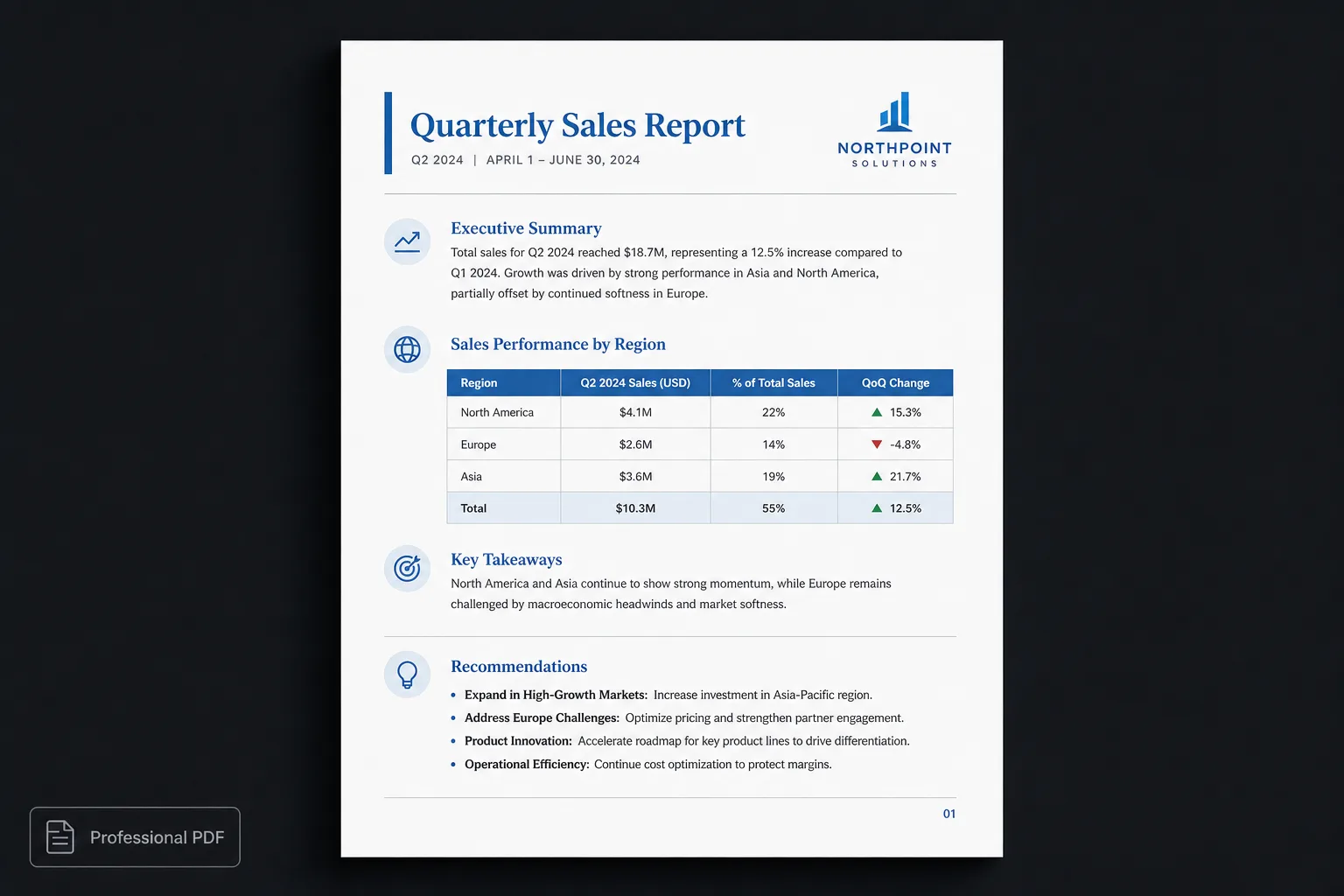
Use clear heading levels
Headings help readers understand how information is organized. Instead of manually adjusting font sizes throughout the document, define a consistent hierarchy.
For example:
# Annual Security Review
## Executive Summary
## Findings
### Authentication
### Infrastructure
## Recommendations
Each heading level communicates the relationship between sections, making the document easier to navigate.
Keep typography consistent
Professional reports don’t rely on decorative fonts. They use typography consistently.
- Choose readable fonts
- Maintain consistent paragraph spacing
- Use predictable heading sizes
- Avoid unnecessary bold, italics, or colours
Readers should never wonder whether two headings represent the same level.
Use whitespace intentionally
Whitespace isn’t empty space. It’s part of the design. Adequate spacing between sections helps readers process information more comfortably.
Crowded documents often feel more difficult to understand, even when the writing itself is excellent. A report should feel open rather than compressed.
Design tables carefully
Tables often contain the most important information in a report. They should:
- Align consistently
- Use readable spacing
- Avoid unnecessary borders
- Keep related information together
- Remain easy to scan
Simple, well-designed tables almost always outperform heavily decorated ones.
Use images with purpose
Images should support the content rather than interrupt it. Whenever possible:
- Keep image sizes consistent
- Add captions where appropriate
- Leave adequate spacing around visuals
- Avoid wrapping text awkwardly around images
A report should feel cohesive from page to page.
Think about pagination
Long reports require careful page layout. Watch for:
- Headings stranded at the bottom of pages
- Large blank areas
- Tables split awkwardly
- Images separated from their explanation
- Sections beginning in unexpected places
Reviewing pagination before publishing makes the final document feel significantly more polished.
Separate writing from formatting
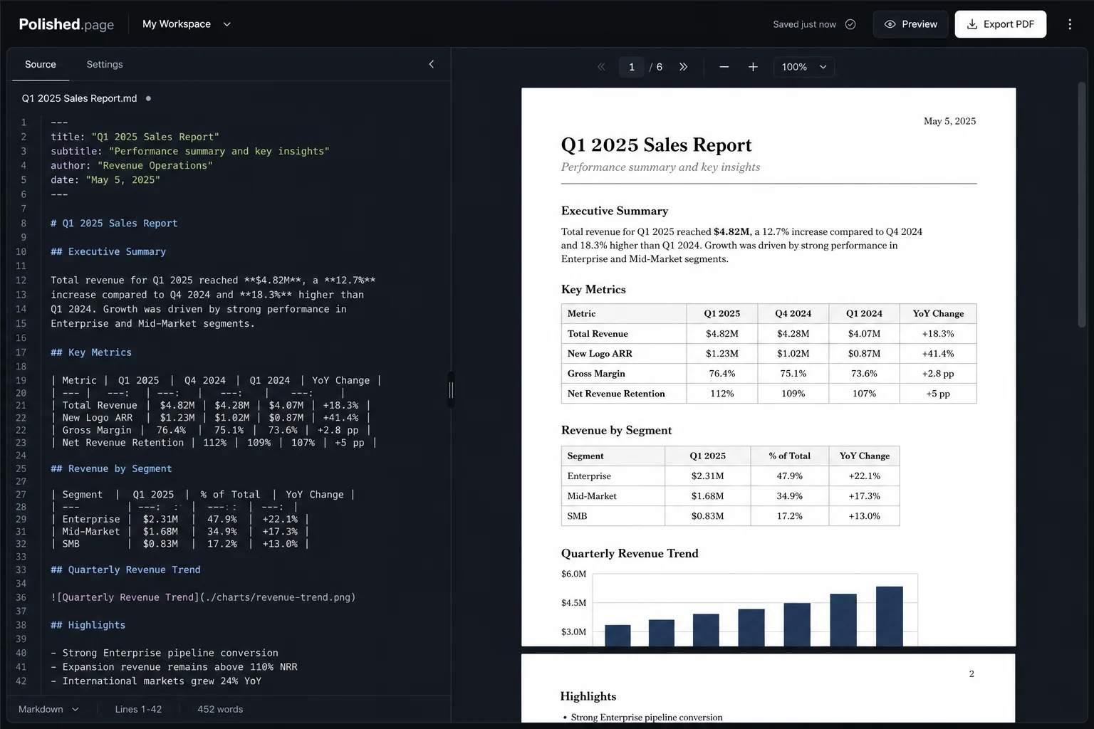
One reason formatting becomes frustrating is that many people design the document while they’re still writing it. A more efficient workflow separates those two activities.
Write first. Format later.
Modern publishing systems make this possible by applying a publication theme after the content is complete. This keeps formatting consistent throughout the document while allowing you to focus on the writing itself.
Formatting is publishing—not editing.
AI has changed report writing
Many reports now begin with AI. ChatGPT, Claude, Gemini, and other assistants can generate:
- Executive summaries
- Project updates
- Research reports
- Technical documentation
- Business proposals
These drafts are often well structured but still require thoughtful presentation before being shared. Instead of manually adjusting every page, publication themes provide a consistent visual identity across the entire report.
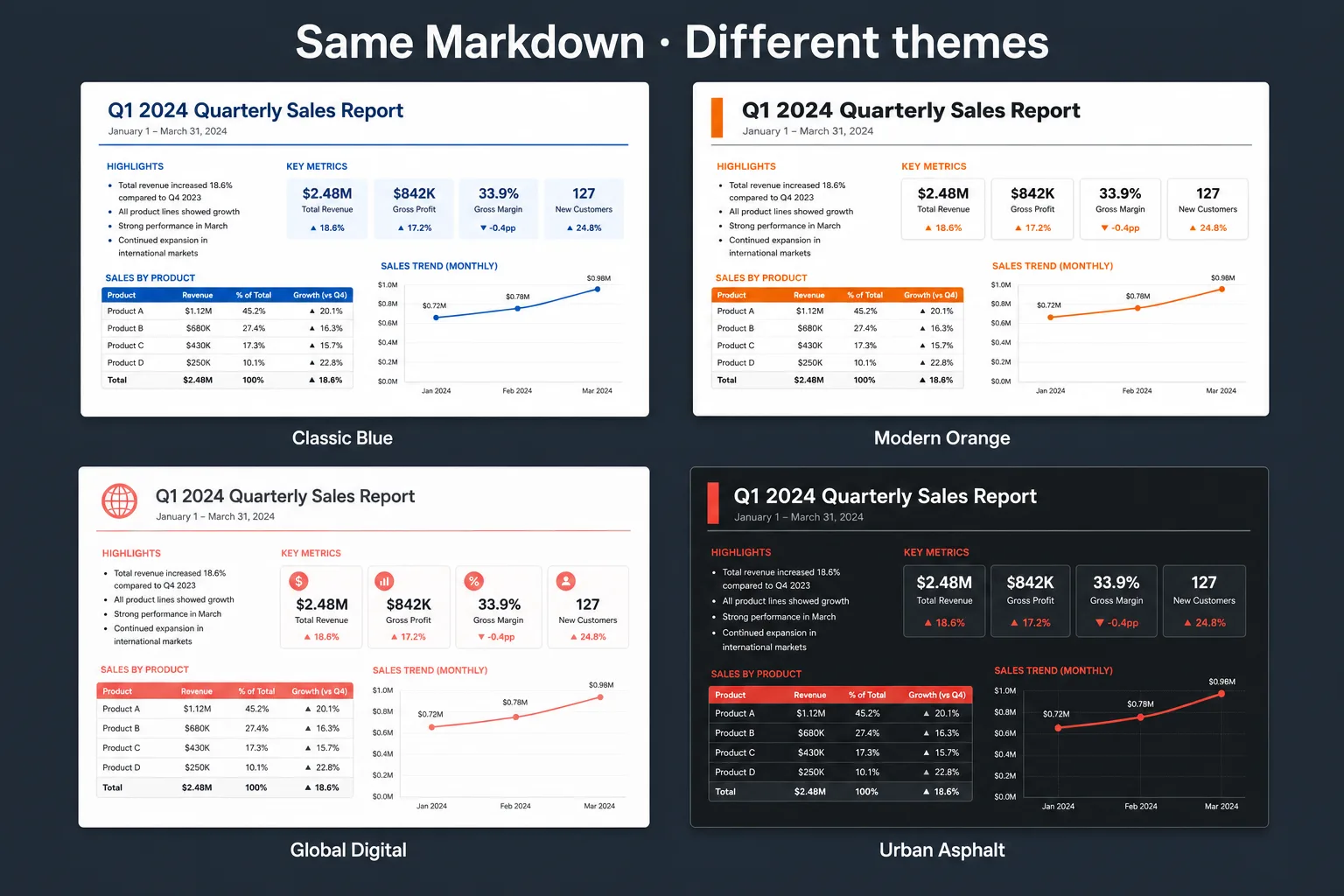
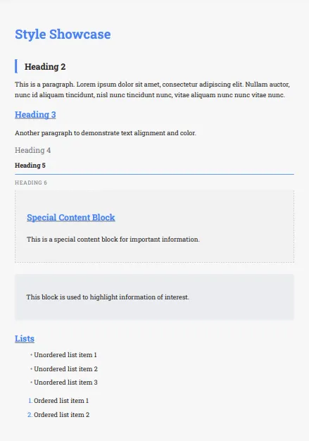
Classic Blue 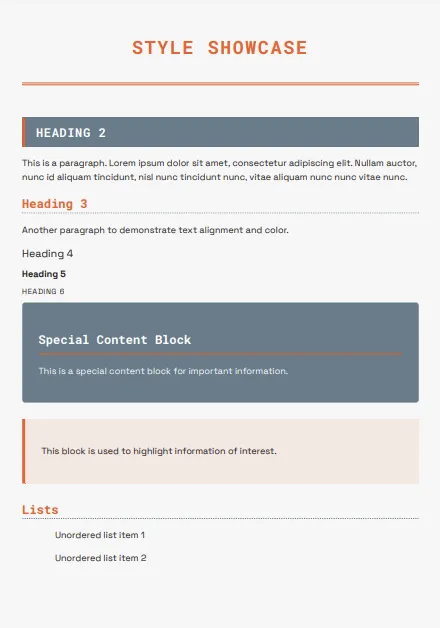
Modern Orange 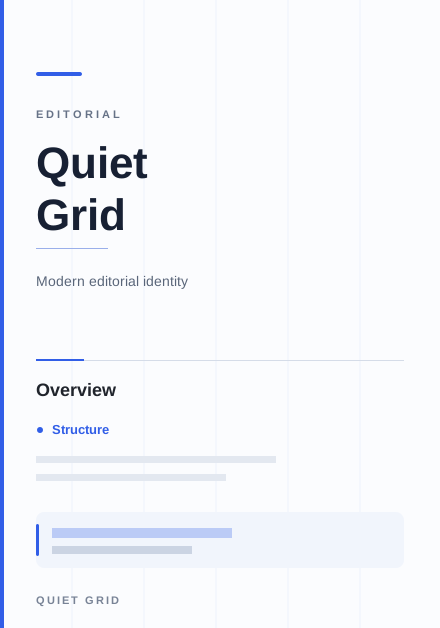
Quiet Grid 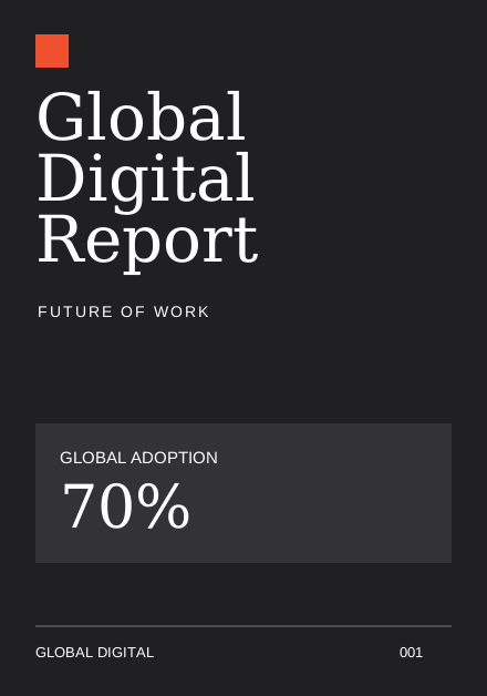
Global Digital
A modern report workflow
A typical workflow today might look like this:
- Plan the report structure.
- Draft the content with AI or write it yourself.
- Review and verify the information.
- Keep the document structured.
- Apply a publication theme.
- Preview the final pages.
- Export a professional PDF.
By treating formatting as publishing rather than editing, reports become easier to maintain and faster to produce.
Live example
Here’s an annual security review you can open directly. Theme it, preview every page, and export the finished PDF when you’re ready.
---
title: Annual Security Review
theme: 14
pageSize: letter
orientation: portrait
coverPage: true
tableOfContents: true
pageNumbers: true
---

# Annual Security Review

## Executive Summary

Authentication and infrastructure remain the highest-priority areas. Access
controls improved over the last cycle, but several review findings still need
owners before the next audit window.

## Findings

### Authentication

| Finding | Severity | Status |
| --- | --- | --- |
| MFA gaps on admin roles | High | Open |
| Session timeout policy | Medium | In progress |
| Password reset flow | Low | Resolved |

### Infrastructure

| Finding | Severity | Status |
| --- | --- | --- |
| Unlabelled production hosts | Medium | Open |
| Backup restore drill overdue | High | Planned |
| TLS certificate monitoring | Low | Resolved |

## Recommendations

1. Close MFA gaps on privileged roles before the next release freeze.
2. Schedule a restore drill and record the outcome in the runbook.
3. Assign owners and target dates for every open finding above medium severity.

## Review Flow

```mermaid
flowchart LR
  A[Draft report] --> B[Verify findings]
  B --> C[Apply theme]
  C --> D[Export PDF]
```

## Conclusion

The programme is improving, but open authentication and infrastructure items
still need clear ownership. Treat formatting as the final publishing step after
the facts are confirmed.
Direct editor entry point: /?example=how-to-format-a-report
The same annual security review becomes a paginated report with a cover, table of contents, clear heading levels, styled findings tables, a Mermaid review flow, and stable page numbers—under a corporate publication theme such as Classic Blue.
Features that help format reports
Polished.page includes features designed for professional reports:
- Publication themes
- Cover pages
- Automatic table of contents
- Page numbering
- Running headers and footers
- Tables
- Images
- Mermaid diagrams
- Callouts
- YAML front matter
- Live paginated preview
- Professional PDF export
These tools help create reports that remain consistent from the title page to the final appendix.
Frequently asked questions
What is the best format for a professional report?
Most professional reports include a clear title page, table of contents, executive summary, well-defined sections, conclusions, and consistent formatting throughout. Not every report needs every section, but hierarchy and consistency matter more than decorative styling.
Which font should I use for reports?
Readability matters more than style. Choose a clean, professional font and use it consistently across the entire document so readers never wonder whether two headings represent the same level.
Should reports include a table of contents?
For longer reports, yes. A table of contents helps readers navigate the document and quickly locate important sections such as findings, recommendations, and appendices.
How long should a report be?
The appropriate length depends on its purpose. Focus on presenting complete, well-organized information rather than reaching a specific page count.
Can AI help write reports?
Yes. AI is excellent at generating structured first drafts, summaries, and outlines. Human review remains essential to verify facts, improve clarity, and ensure the document meets its intended purpose.
What’s the easiest way to keep formatting consistent?
Separate content from presentation. Instead of manually formatting every page, use a publication theme that applies consistent typography, spacing, and layout across the entire document.
Final thoughts
Great reports don’t stand out because they use unusual fonts or elaborate graphics. They stand out because every page feels consistent.
Clear structure, readable typography, thoughtful spacing, and predictable layouts help readers focus on the message rather than the formatting.
Whether you’re writing the report yourself or starting with AI, treating formatting as a publishing step creates documents that are easier to read, easier to maintain, and more professional to share.
Keep exploring
This guide is a hub for more specific report and formatting workflows:
- How to Format a ChatGPT Report
- How to Make a PDF Look Professional
- How to Make a Word Document Look Professional
- AI Document Formatting
- Markdown to PDF
- Markdown to Word
- Apply a Theme to an Entire Document
- Professional Document Templates
- Open the Polished.page editor
- Write professional documents with ChatGPT
- Convert ChatGPT to PDF
- Convert ChatGPT Markdown to PDF
- Browse publication themes
- Document templates
- More guides